Howdy, folks! I've just finalized my calendar for next month on my Upcoming Events page. Please check it out to see where I'll be stampin' in September!
Click on the Upcoming Events tab above, or click HERE to see what's going on.
Cathy ;D
This page is all about having fun with paper! Find ideas and instructions for cards and other fun projects on my Home page. Click on Upcoming Events for class schedules and other upcoming events.
Thursday, August 29, 2019
Thursday, August 15, 2019
Stamp Camp North Cards (8/10/2019)
Ok, I've finally given up on going back and catching up beginning with where I left off. Instead, I'm making a fresh start this morning with current creations and will then "fill in" when I can with things I've missed. I really want you to see some of the great cards people are making with the stamp sets from the 2019-2020 catalog, so I'm starting with this past Saturday's stamp camp at Westminster Elks.
Please click on the photos below for a closer look.
Check back soon for ingredients list and instructions to make make my sloth card. In the meantime, I hope you are able to get a little inspiration from these great cards!
Cathy ;D
Please click on the photos below for a closer look.
Check back soon for ingredients list and instructions to make make my sloth card. In the meantime, I hope you are able to get a little inspiration from these great cards!
Cathy ;D
Saturday, August 3, 2019
Summer Fun at the Beach!
This card was made at my table at Rose Hill Stamp Camp in May 2019, and also in my July class in my craft room.
Thanks to Jacque Williams, a Stampin’ Up! Demonstrator in New Zealand, for this design. View Jacque's original design at http://stamphappy.co.nz/2017/07/colour-inkspiration-14-gift-set-wedding/.
Materials:
Inside:
For the inside of this card, I used the circle die to cut a corner from a large sticky note and used it as a template. I then attached the sticky note to a 5-1/4" x 4" piece of Whisper White card stock, exposing only the lower left-hand corner. The inside was stamped and sponged exactly the same as the circle on the front of the card . . . except for the birds. Before stamping the birds, I removed the sticky note so they could fly outside of the circle.
 |
| Click on image for closer look. |
Stamp Sets:
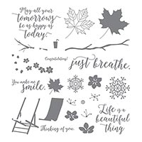
* Colorful Seasons (sentiment)
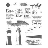
* High Tide (birds)
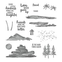
* Waterfront (speckles and blue in background)
Paper:
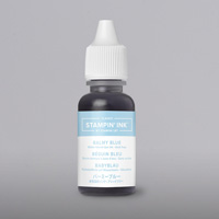
* Balmy Blue card stock (8-1/2” x 5-1/2”; about 3” x 3” for scalloped
circle)
* Whisper White card stock (5-1/4” x 4” for layer; about 3” x 3” for
circle)
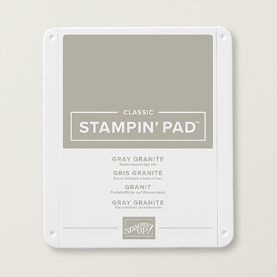
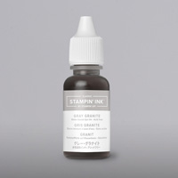
* Gray Granite card stock (5-1/8” x 3-7/8”)
* Wood Textures 6” x 6” DSP (retired) (about 2-1/4” x 1-3/4” for chair)
* Vellum card stock (about 2-1/4” x 5/8” for sentiment)
Ink:
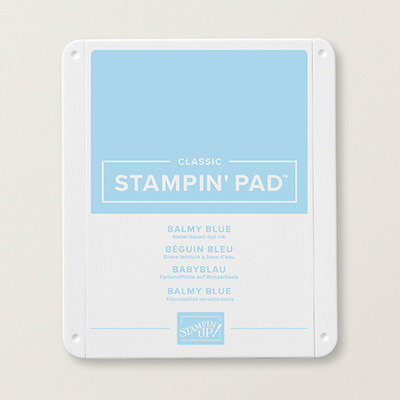
* Balmy Blue Classic Stampin’ Pad
* Gray Granite Classic Stampin’ Pad (birds and sand)
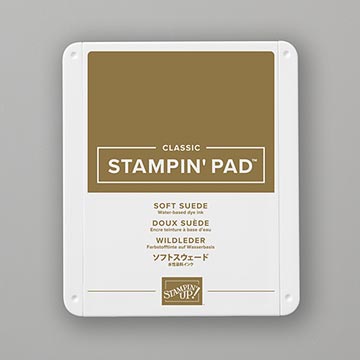
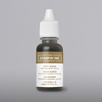
* Soft Suede Classic Stampin’ Pad (sentiment)
Accessories and Tools:
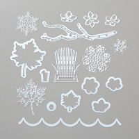
* Seasonal Layers Die (chair)
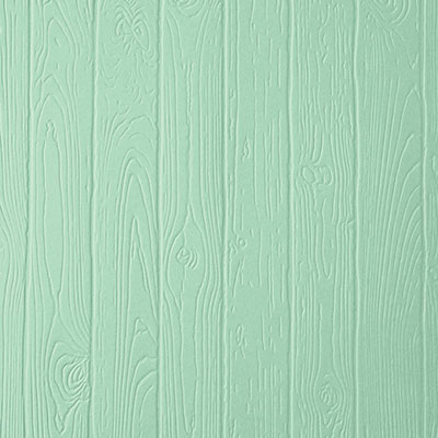
* Pinewood Planks Embossing Folder
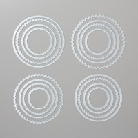
* Layering Circles Dies
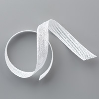
* Flax Ribbon (5”)
* Mini Sequin Trim (retired)
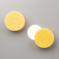
* Stampin’ Sponge
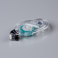
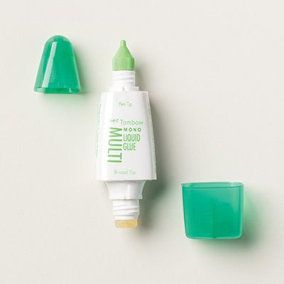
* Adhesives: SNAIL; Liquid Glue;
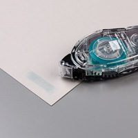
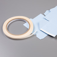
Tear ‘n Tape
Other Supplies (all retired Stampin’ Up! items):**
* Mini Stapler
* Washi Tape Punch
** My apologies for listing a few retired items for this card. Since the card was originally made at the end of
the catalog year, these items were not yet retired. There are items in the current catalog that
will substitute nicely for these items.
NOTES:
- Nothing on this card is popped up; all pieces are attached with either SNAIL Adhesive or Liquid Glue. I also added a tiny bit of Tear ‘n Tape behind the bottom of the ribbon to hold it in place.
- On the Whisper White circle, Balmy Blue ink was very lightly sponged behind the birds; Gray Granite was very lightly sponged behind the speckles to give the scene a little more color.
Author’s Note: I chose these
colors rather than the more vivid colors used on the original design because these reminded
me of a calm oceanside beach house (at least the ones I’ve seen in magazines . . .
I live in Colorado – no oceans here).
Cathy ;D
Subscribe to:
Comments (Atom)


